


绘制柱状图让数据不再单调
应客户需求,需要将干巴巴的数据可视化,做同期数据对比。所以就从网上找了条代码,生成柱状图。
链接:http://www.cnblogs.com/puresoul/p/7520246.html
源码:
import xlsxwriter
def map2():
    # 创建一个excel
    workbook = xlsxwriter.Workbook("C:\\chart_column.xlsx")
    # 创建一个sheet
    worksheet = workbook.add_worksheet()
    # worksheet = workbook.add_worksheet("bug_analysis")

    # 自定义样式,加粗
    bold = workbook.add_format({'bold': 1})

    # --------1、准备数据并写入excel---------------
    # 向excel中写入数据,建立图标时要用到
    headings = ['Number', 'testA', 'testB']
    data = [
        ['2017-9-1', '2017-9-2', '2017-9-3', '2017-9-4', '2017-9-5', '2017-9-6'],
        [10, 40, 50, 20, 10, 50],
        [30, 60, 70, 50, 40, 30],
    ]

    # 写入表头
    worksheet.write_row('A1', headings, bold)

    # 写入数据
    worksheet.write_column('A2', data[0])
    worksheet.write_column('B2', data[1])
    worksheet.write_column('C2', data[2])

    # --------2、生成图表并插入到excel---------------
    # 创建一个柱状图(column chart)
    chart_col = workbook.add_chart({'type': 'column'})

    # 配置第一个系列数据
    chart_col.add_series({
        # 这里的sheet1是默认的值,因为我们在新建sheet时没有指定sheet名
        # 如果我们新建sheet时设置了sheet名,这里就要设置成相应的值
        'name': '=Sheet1!$B$1',
        'categories': '=Sheet1!$A$2:$A$7',
        'values':   '=Sheet1!$B$2:$B$7',
        'line': {'color': 'red'},
    })

    # 配置第二个系列数据(用了另一种语法)
    chart_col.add_series({
        'name': '=Sheet1!$C$1',
        'categories':  '=Sheet1!$A$2:$A$7',
        'values':   '=Sheet1!$C$2:$C$7',
        'line': {'color': 'yellow'},
    })

    # 配置第二个系列数据(用了另一种语法)
    # chart_col.add_series({
    #     'name': ['Sheet1', 0, 2],
    #     'categories': ['Sheet1', 1, 0, 6, 0],
    #     'values': ['Sheet1', 1, 2, 6, 2],
    #     'line': {'color': 'yellow'},
    # })

    # 设置图表的title 和 x,y轴信息
    chart_col.set_title({'name': 'The xxx site Bug Analysis'})
    chart_col.set_x_axis({'name': 'Test number'})
    chart_col.set_y_axis({'name':  'Sample length (mm)'})

    # 设置图表的风格
    chart_col.set_style(1)

    # 把图表插入到worksheet以及偏移
    worksheet.insert_chart('A10', chart_col, {'x_offset': 25, 'y_offset': 10})

    workbook.close()
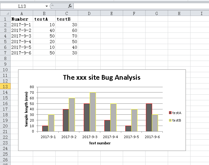
运行效果:


👍🏻,学习