#!/usr/bin/env Python3
# -*- coding: utf-8 -*-
# @Software: PyCharm
# @virtualenv:workon
# @contact: 1040691703@qq.com
# @Desc:Code descripton
__author__ = '未昔/AngelFate'
__date__ = '2020/4/28 12:44'
# -*- coding:utf-8 -*-
import xlsxwriter
# 创建一个excel
workbook = xlsxwriter.Workbook("chart_line.xlsx")
# 创建一个sheet
worksheet = workbook.add_worksheet()
# worksheet = workbook.add_worksheet("bug_analysis")
# 自定义样式,加粗
bold = workbook.add_format({'bold': 1})
# --------1、准备数据并写入excel---------------
# 向excel中写入数据,建立图标时要用到
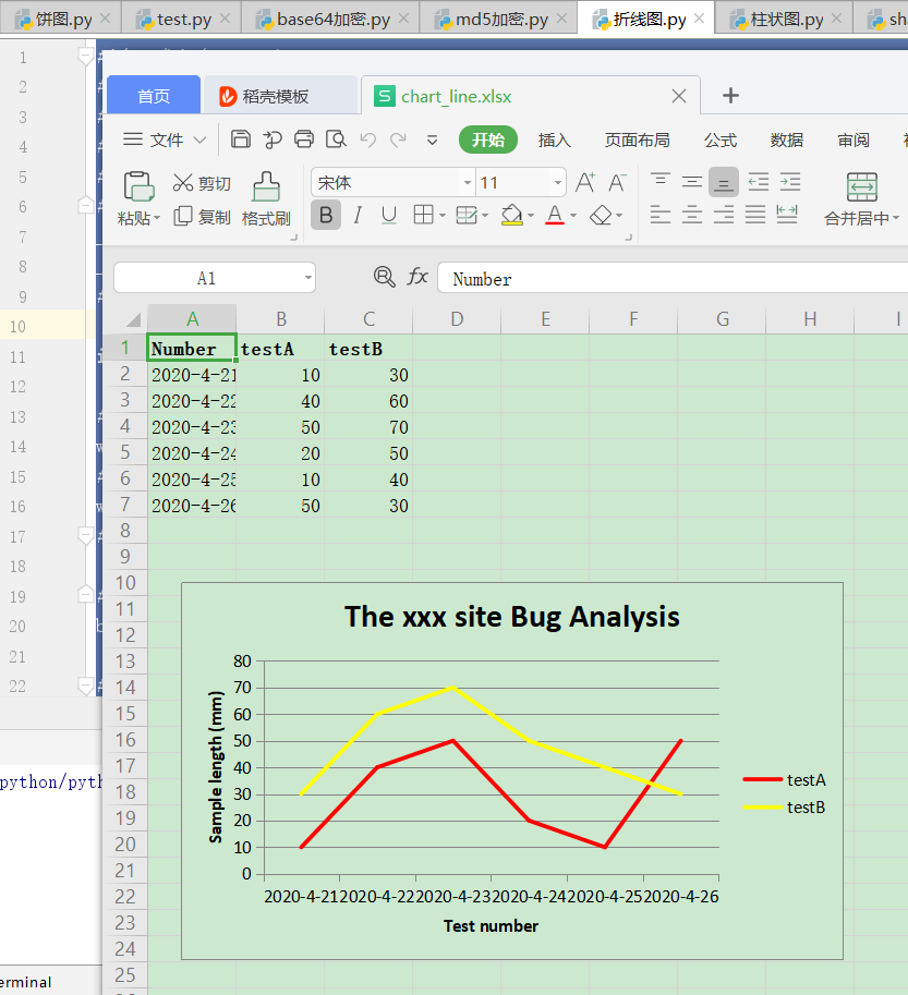
headings = ['Number', 'testA', 'testB']
data = [
['2020-4-21', '2020-4-22', '2020-4-23', '2020-4-24', '2020-4-25', '2020-4-26'],
[10, 40, 50, 20, 10, 50],
[30, 60, 70, 50, 40, 30],
]
# 写入表头
worksheet.write_row('A1', headings, bold)
# 写入数据
worksheet.write_column('A2', data[0])
worksheet.write_column('B2', data[1])
worksheet.write_column('C2', data[2])
# --------2、生成图表并插入到excel---------------
# 创建一个柱状图(line chart)
chart_col = workbook.add_chart({'type': 'line'})
# 配置第一个系列数据
chart_col.add_series({
# 这里的sheet1是默认的值,因为我们在新建sheet时没有指定sheet名
# 如果我们新建sheet时设置了sheet名,这里就要设置成相应的值
'name': '=Sheet1!$B$1',
'categories': '=Sheet1!$A$2:$A$7',
'values': '=Sheet1!$B$2:$B$7',
'line': {'color': 'red'},
})
# 配置第二个系列数据
chart_col.add_series({
'name': '=Sheet1!$C$1',
'categories': '=Sheet1!$A$2:$A$7',
'values': '=Sheet1!$C$2:$C$7',
'line': {'color': 'yellow'},
})
# 配置第二个系列数据(用了另一种语法)
# chart_col.add_series({
# 'name': ['Sheet1', 0, 2],
# 'categories': ['Sheet1', 1, 0, 6, 0],
# 'values': ['Sheet1', 1, 2, 6, 2],
# 'line': {'color': 'yellow'},
# })
# 设置图表的title 和 x,y轴信息
chart_col.set_title({'name': 'The xxx site Bug Analysis'})
chart_col.set_x_axis({'name': 'Test number'})
chart_col.set_y_axis({'name': 'Sample length (mm)'})
# 设置图表的风格
chart_col.set_style(1)
# 把图表插入到worksheet并设置偏移
worksheet.insert_chart('A10', chart_col, {'x_offset': 25, 'y_offset': 10})
workbook.close()


这个有用